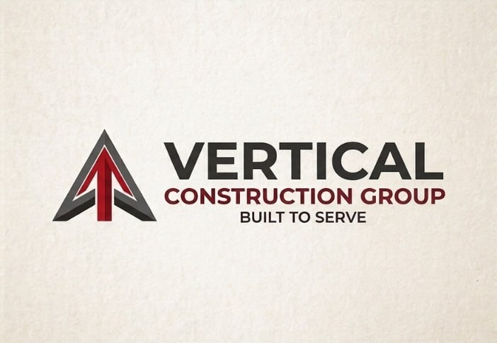
01 · The Wordmark
Raleway
The logo's text is a geometric sans with a distinctive condensed weight range: heavy 800-cap for the name, tracked 600-cap for the descriptor. Two independent letterform comparisons (C-terminals, R-legs, V-apexes, cap proportions) selected Raleway from ten candidates. It ships with a full weight ladder, which is why it carries the whole site.
Vertical
Construction Group
Raleway 800 / 600
line 2 at 31% size
tracking +0.52em
Logo facts (measured)
- One family, two weights: 800-class name over 600-class descriptor
- Line 2 is 31% the height of line 1, set in wide caps
- Monogram: faceted V — steel bevel #5B5A58, oxblood fill #721017, burgundy accent #A31E22
Website headers
- Raleway 700–800 for all headings and the nav wordmark
- Uppercase + tracking only for eyebrows/kickers, never for full headings
- Never italicize a heading — the mark is upright, so the voice is upright
Body & UI text
- Inter 300–500 for paragraphs, lists, forms, buttons
- Inter is the neutral counterweight: Raleway speaks, Inter explains
- Line length 60–75 characters; line-height 1.75